
Have you ever felt your heart rate suddenly slow down after walking into a living space? It is a curious thing, how some spaces make us feel like we are holding our breath, while others allow us to exhale completely. We are realizing that our homes need to be more than just four walls. They have become our necessary retreat from a high speed digital world.
Are your walls helping you find mental clarity, or are they just adding to the noise? The conversation around color psychology in wall decor is moving toward something much deeper than just looking pretty. We are looking for color medicine: shades that actually help our nervous systems rest. Two colors have emerged as the perfect pair for this: Terracotta and Deep Indigo.
One connects us to the warm earth beneath our feet, while the other reflects the quiet, endless sky. Together, they help fix the mental fatigue so many of us feel today.
Why We Crave Healing Colors
There is a real shift happening right now. After so much time spent glued to screens, we are all looking for stability.
- Helping Your Body Clock: We are using color to help our internal clocks stay on track. These two shades mimic the soft light of sunset and twilight, telling your body it is time to transition from work to rest.
- A Feeling of Permanence: In a world where everything feels temporary, the steady presence of Indigo and the solid feel of Terracotta make a home feel secure.
- Eyesight Relief: Warm, earth based tones give our eyes a break from the harsh blue light of our phones and laptops, helping our minds settle.
The Grounding Grace of Terracotta
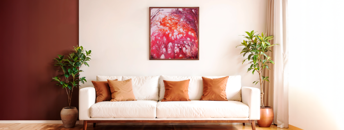
Terracotta is Often called Warm Clay or Sienna Soul, this color feels like a warm hug for your home. It is a gentle invitation to slow down and just be.
A Natural Connection
The rich, red-based earth tones are known to help lower stress by reminding us of the natural world. This is a simple way to help the nervous system settle after a long day of digital saturation.
A Feeling of Warmth
By mimicking the flicker of fire and sun-baked clay, this print acts like a warm hug for your home.
Versatile Display
Whether you choose to feature it as a large statement piece or a smaller accent, its energy brings an honest, life-affirming presence to your sanctuary.
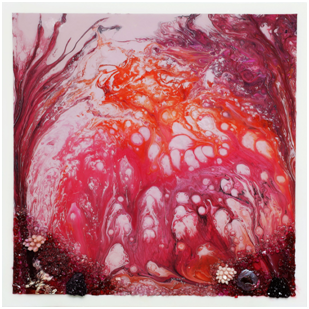
Have you ever looked at a painting and felt the immediate, warm hum of a celebration? Lamplit Roads Leading to the Festival captures that exact moment of anticipation. This piece uses a base of Terracotta and fiery oranges to mimic the glow of traditional lamps, creating a sense of hospitality in any room.
Find the above painting here.
The Architecture of Silence: The Deep Peace of Indigo
If Terracotta is the ground, Deep Indigo is the deep sea calmness for us. Indigo is the top choice for people who value their quiet time. It is a color that feels important but also incredibly peaceful.
A Shield for the Senses
Indigo is often seen as a sensory shield. In a home office or bedroom, this piece helps the brain focus by moving daily distractions into the background.
Helping the Body Rest
The cool, deep blues signal to our internal clocks that it is time to transition from the hurry of the day into a state of recovery and rest.
A Symbolic Language
Inspired by the movement of water and the weight of history, this piece offers a thoughtful interplay of light that turns any wall into a space for reflection.
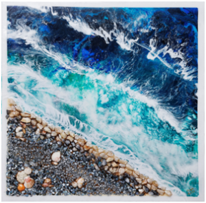
If you are looking for a way to quiet the mind, Embrace of the Silken Waters serves as a gentle counterweight to the noise of modern life. This work highlights the meditative depth of Deep Indigo and teal, mirroring the restorative power of the sea and the evening sky.
Find the above painting here.
The Color Palette: A Simple Guide
To help you balance these two colors in your home, here is a quick look at how they work.
| Feature | Terracotta (Earthy tone) | Deep Indigo (Water tone) |
| The Feeling | Rooted, Secure, Nostalgic | Meditative, Wise, Calm |
| What it Pairs With | Sage Green, Creamy Sand | Brass, Soft White, Ash Wood |
| Health Benefit | Lowers anxiety; adds warmth | Helps focus; aids deep sleep |
| Best Room | Living areas, dining rooms | Bedrooms, studies, libraries |
Bringing These Colors into Your Home
The goal is to make your home feel like one cohesive experience. You want the color to feel like it truly belongs to the space.
For Terracotta: Use this in rooms where you want people to talk and connect. It looks beautiful in matte finishes or on large canvases where you can see the texture of the paint.
For Indigo: This is your anchor for solitude. Use it in rooms where you want to disconnect from the busy world. It makes a room feel protective and private. When paired with warm metals like brass, it looks sophisticated but stays very humble.
By embracing Terracotta for its warmth and Deep Indigo for its depth, we are doing more than just painting walls; we are creating a sanctuary for the soul.
Find the piece that resonates with your own story- Explore the collection now!
About the Artist
While Lachman Ludhani spent decades shaping the Mumbai skyline with the Evershine Group, his focus always reached beyond the physical structures. For him, building homes was about creating spaces where families could live with dignity and a true sense of belonging. He believed that the most important foundations weren’t made of bricks and mortar, but of integrity and a commitment to people.
His path into the world of painting opened up much later, born from a deep love for his late wife, Mira Ludhani. He didn’t set out to become an artist in the traditional sense; instead, he picked up the brush to find a way to speak to her in the silence she left behind. Every color he selects and every stroke he places is a heartfelt tribute to her a living memory that keeps her spirit vibrant, both on the canvas and in his heart.